Everyday Beats
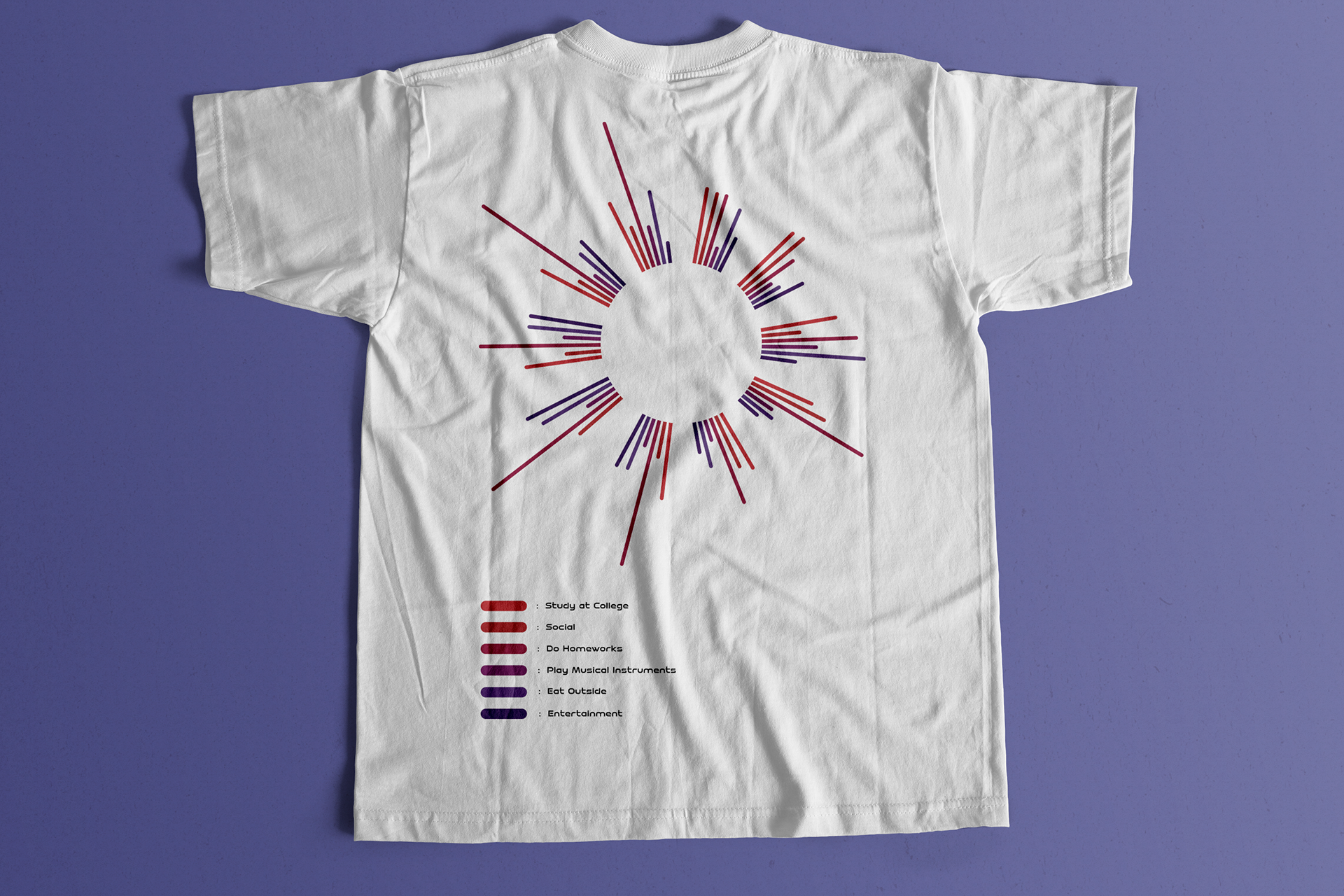
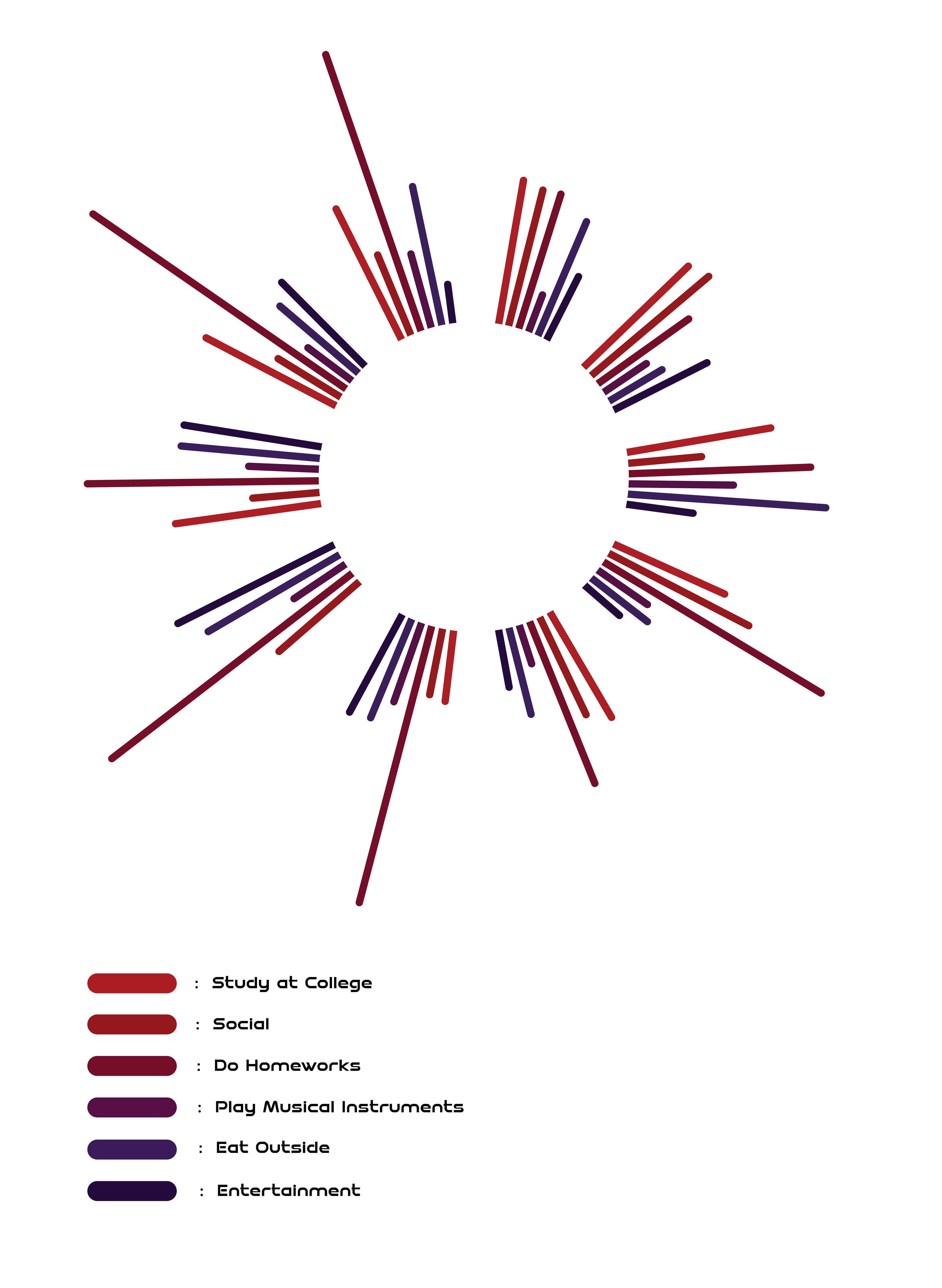
I always love T-shirt designs, especially to express myself in different designs; Therefore, I would love to present my data by creating a T-shirt printing design. The design was inspired by volume bars that always visualize the volume of a song. I am currently studying Ableton Live 11, a software that allowed me to learn how to compose songs with MIDI instruments. While I was hanging on the software, I saw the bar growing as the instruments assembled together. That’s why this project is called Everyday Beats. The beats basically represent my daily life basis.
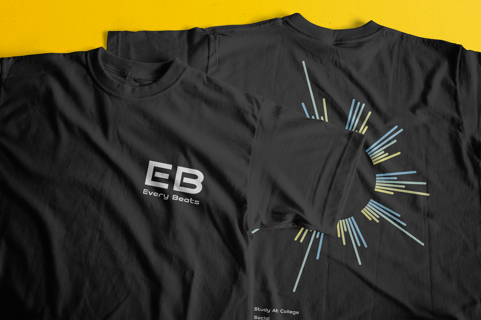
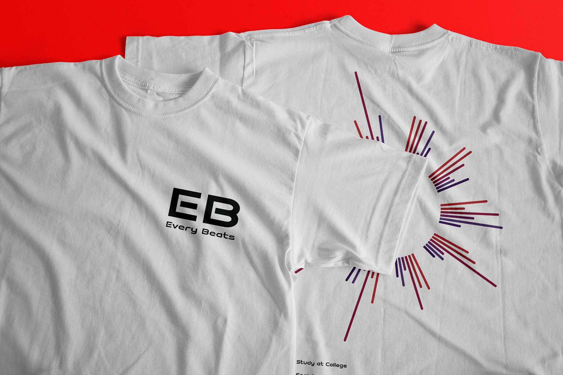
However, I felt like volume bars seemed to be same as bar charts in general. In order to make the design look interesting, I made it rounded like volume visualizer that I usually watch NCS (Non Copyright Song) on YouTube. Music has always been my passion besides design, so why not I combine those elements to create something unique.
By experimenting two different color palettes, that allowed me to create black and white series of shirts. I used blue to yellow gradient colors applied on the black edition, whereas the red to purple applied on the white edition. I always see T-shirt brands and they usually provide black and white edition, that’s why I created two different colors of design as part of my process.
My Data Collection
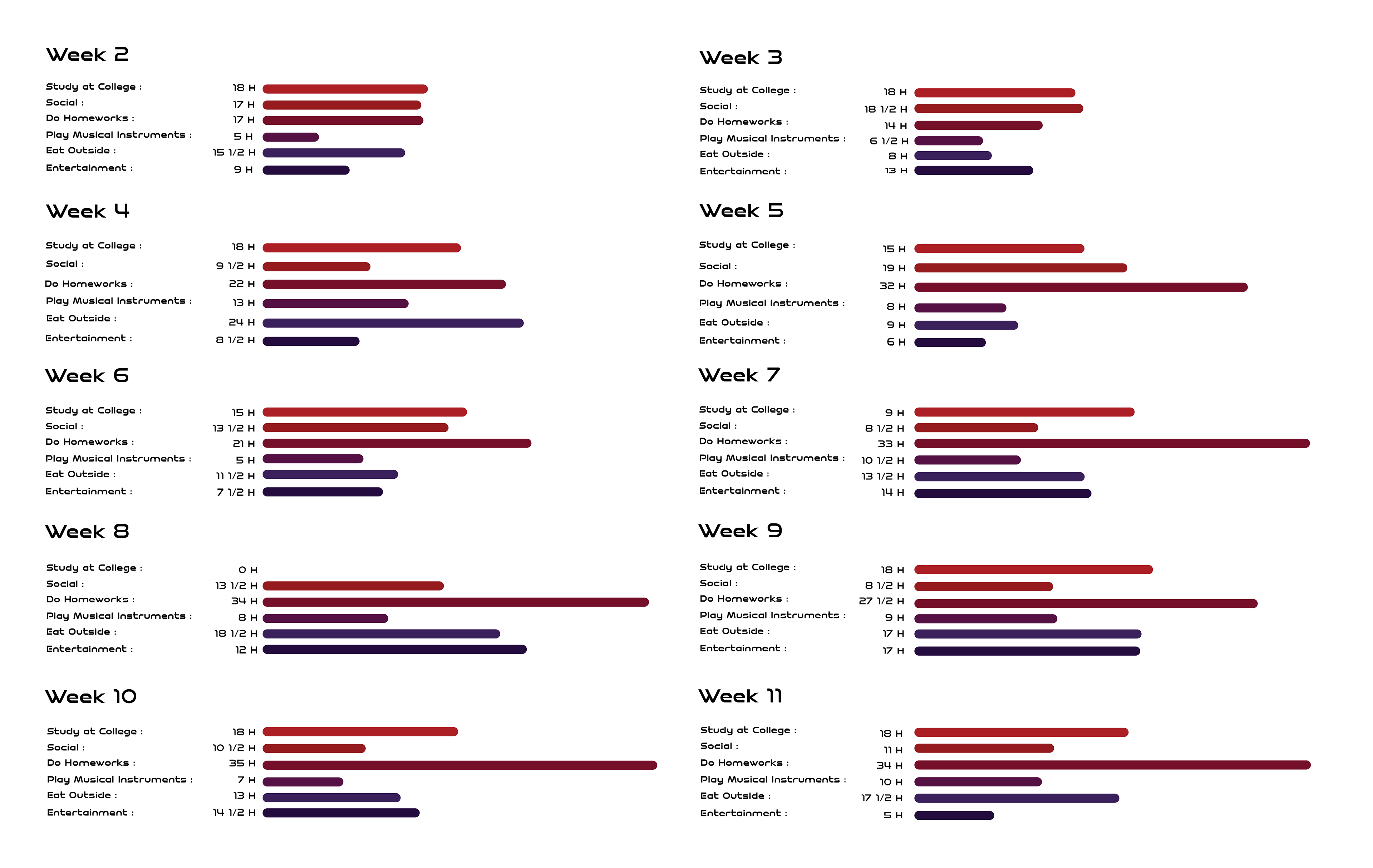
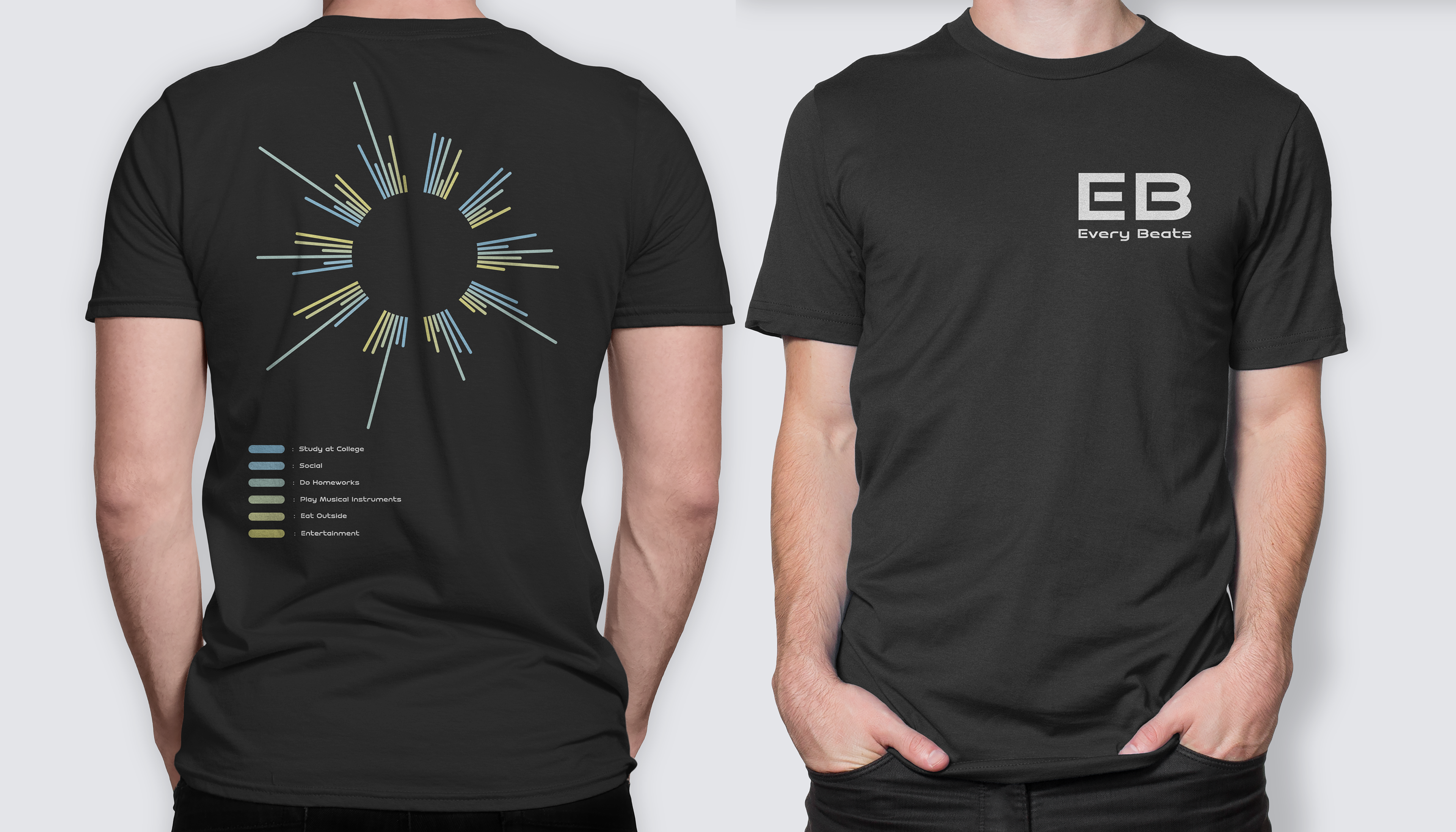
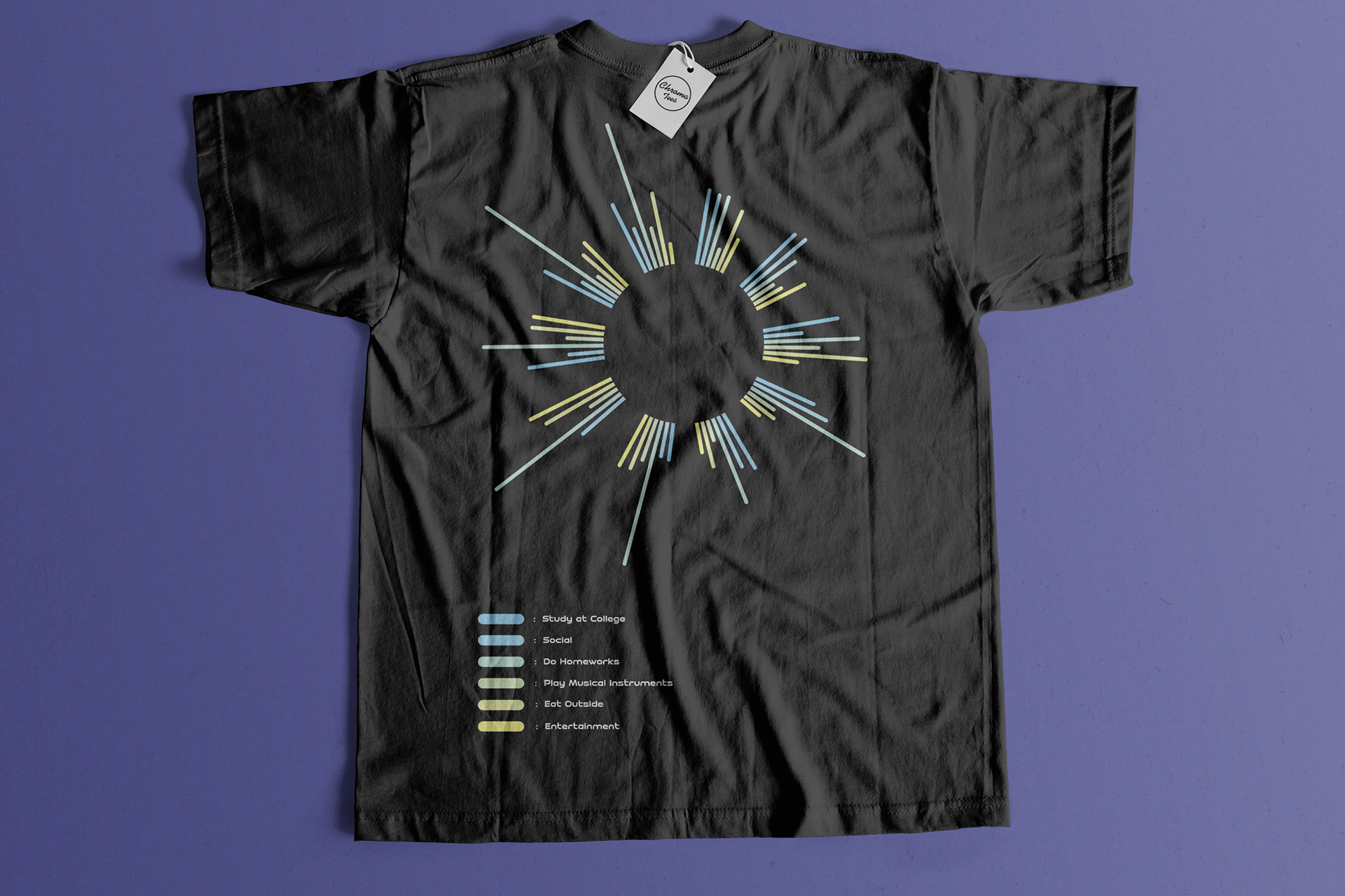
The 10 weeks of data collections shows me that I am a busy person. In evidence, my social category didn’t increase as much as I expected as I always did homework from school and others. But that doesn’t mean I didn’t prefer going out with friends. Term 2 of study made me not want to go out to enjoy myself. I only went outside to eat or gather with my friends in a community. I chose the “Study at College” category to make my work easier so I thought the line would be the same measurement. But due to the lecturer of my coding elective module took mc twice, allowed the data to change my expectation, but it was also interesting to see the dynamic of the data changes. At the end of the day, I decided to present all the data by summing of the hours from day by day as that was the only method I could apply on my work.
Workflow
I decided to specify a range of position between red & purple / Blue & Yellow since it had six categories in order to show the flow of the gradient. The data visualization kicks off with week 2 from the top right. Followed by week 3 and go all the way round to the final destination at the top left (week 11). In order to make the execution straightforward, I put a white circle to hide the volume bars to form a rounded volume visualizer. I used line elements to draw on Illustrator and make the corner rounded instead of rectangle because I felt like the outcome would be the same as bar charts in general. Each color represents categories that I often do throughout this semester. Starts from the most essential part that is “Study at College” as red color and ended with entertainment as purple color.